If you follow me on Instagram, you know that the great kitchen renovation of 2014 has begun. Sort of. We’ll talk about it soon. But first, let’s take a tour of the kitchen before we started tearing into it.
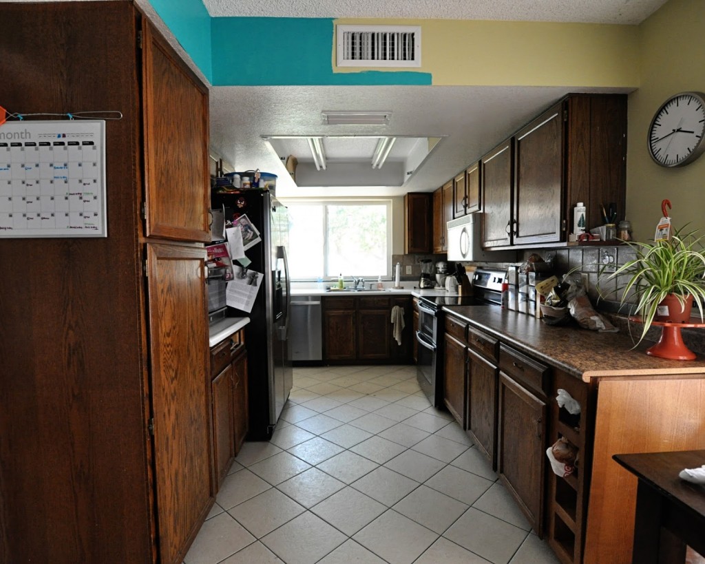
Welcome to the cave.
How do I loathe thee, kitchen? Let me count the ways.
First, there’s the dropped ceiling. There are a few places in our house with dropped ceilings, including the entryway and the weird vestibule thing in the master bedroom. (By the way, I reeeeeally need to do an updated house tour. Much has changed since those photos were taken.) In most cases the drop doesn’t bother me; in fact, it helps some rooms feel bigger when you walk in and the ceiling opens up a bit. In the kitchen? No. It feels like the walls are closing in on me.
Also, don’t mind that half that upper wall bit is turquoise and half is green. The green was driving me crazy, so in a fit of spontaneous painting (I blame crazy brain) I redid the family room (again with the outdated photos). I don’t love it. It’ll be a different color as soon as I pick one I like.
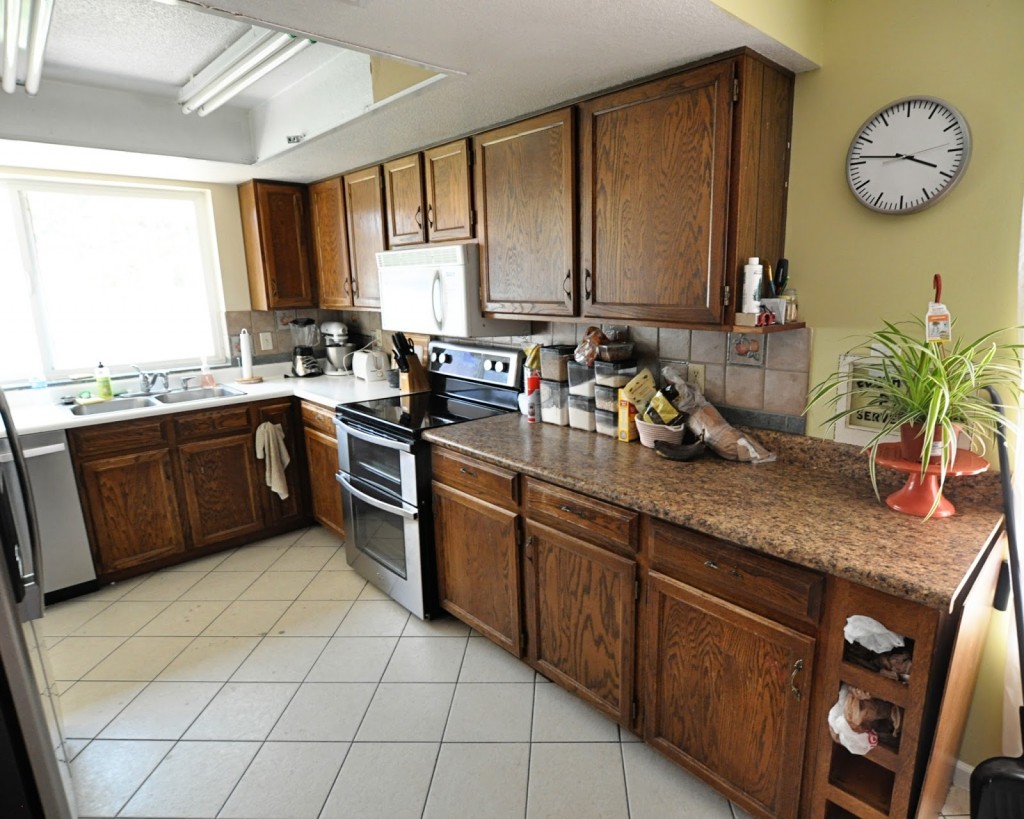
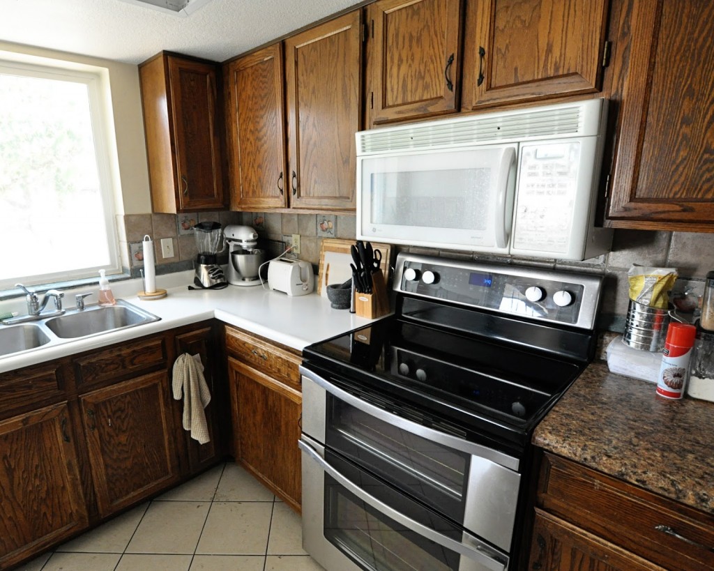
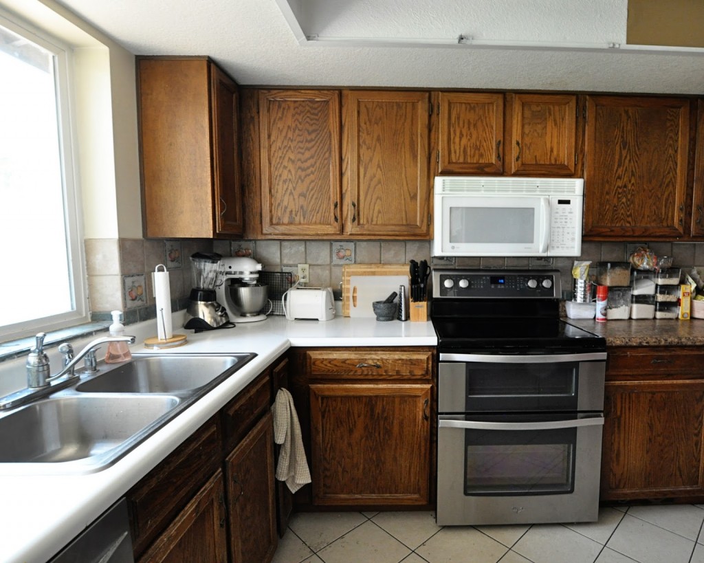
Here’s the wall on the right. A few points to notice: the cubbies (which I assume are for wine storage) in the lower right part of the cabinet and are (for us) a complete waste of space, the faux granite laminate on the right and the white laminate on the left (why don’t they match???), and the lovely white microwave above the range. Let’s take a closer look, shall we?
Remember that I am six feet tall. This microwave stares me right in the face every time I cook anything. I have to bend down to even see the knobs and buttons on my fancy-pants oven. I wouldn’t mind too much, except that it doesn’t work. I mean, the vent and the timer are functional, so we use those, but that’s about it. It mostly just smells like burning plastic when you turn it on, which is not terrifying at all.
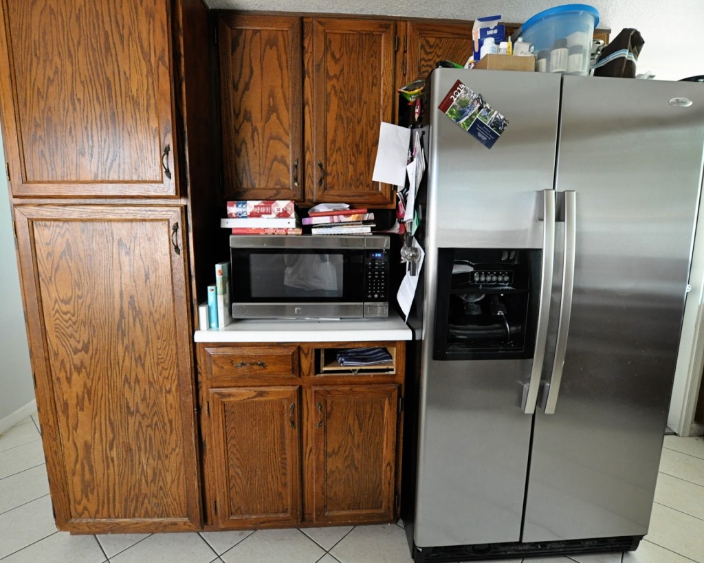
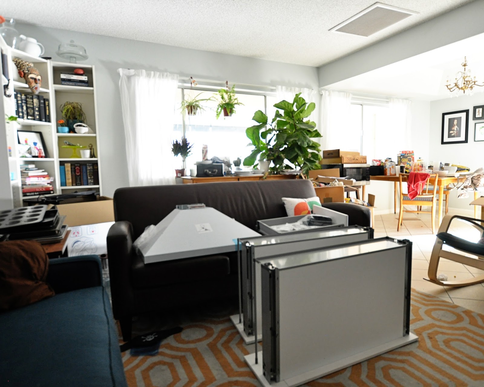
On the opposite wall we have the microwave we actually use. Since moving in two years ago, we’ve purchased all new appliances for the kitchen, so at least that renovation expense is already taken care of. On the left is a cavernous cabinet with NO SHELVES inside. We keep our trash can in there. Can you say waste of space? Oh, and one of the drawer faces fell off a couple weeks ago. I think our kitchen was trying to tell us something.
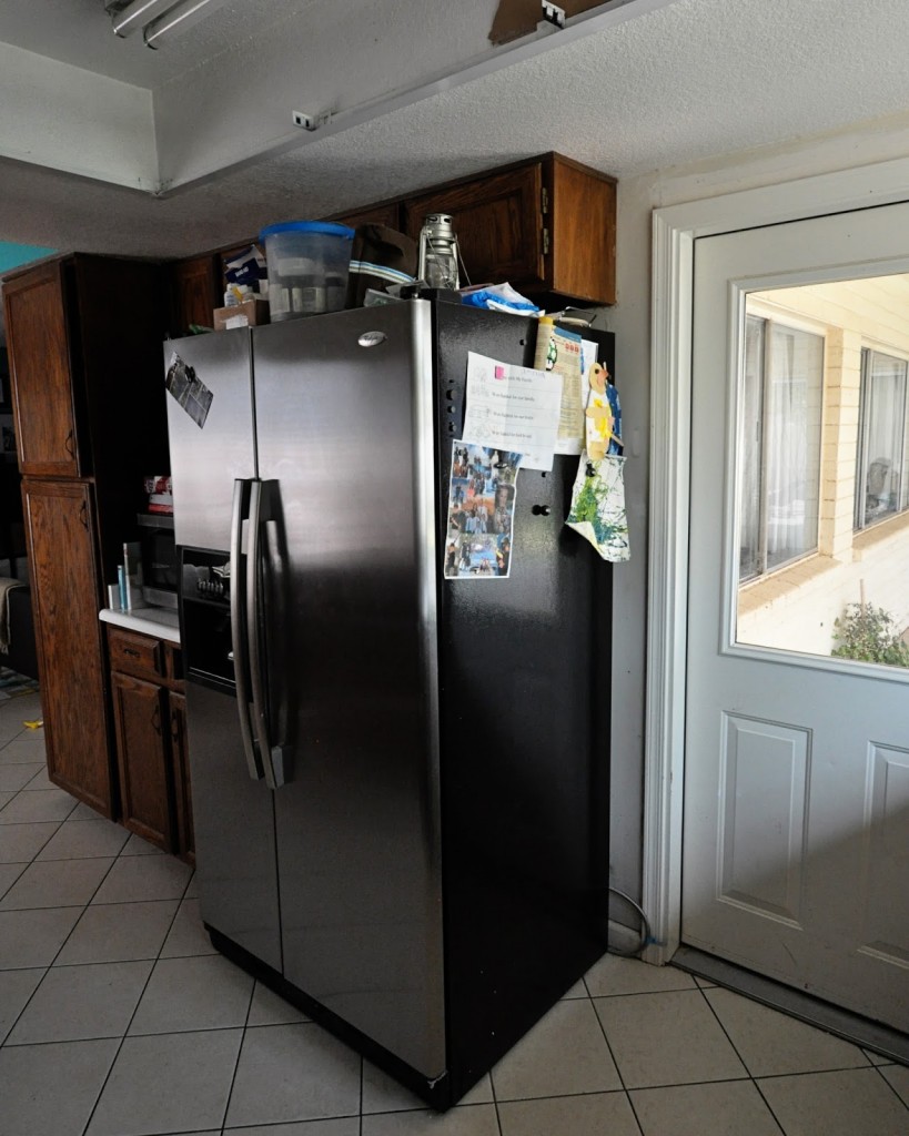
Next to the fridge is a door onto the covered patio and our back yard. The fridge sticks out so far into the kitchen that the traffic flow from inside the house to that door is all wonky. It annoys me even more than the tiny, useless cabinets above the fridge. Even at my height, how am I supposed to reach those things?
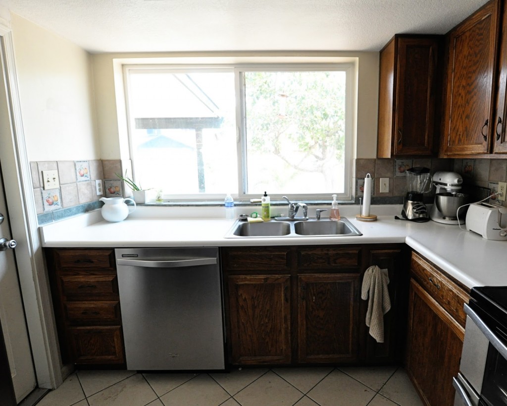
Here’s the view from that door. Do you see how much stuff is on my counters? That’s because those upper cabinets are so dang small. There is not enough room for all my baking ingredients, and all cereal boxes are too tall to fit inside. All of them.The counters always feel cluttered and it stresses me out. Plus there’s no room for rolling out pie crusts and things.
Things I love: That giant window. It faces south but rarely gets direct sunlight, so it’s bright but not not too bright or (more importantly) hot. Between that window and the one in the door, I can see almost the entire back yard from the kitchen, which is fantastic.
Things I don’t love: those dark cabinets. Combined with the dropped ceiling, they make the space seem dark and crowded, despite the natural light that floods in all day. Another thing I don’t love: that backsplash. You may remember seeing these fruit tiles in the tour of trims I did when we first moved in. I will not be sad to see them go, not even a little bit.
A third thing I don’t love: the recessed fluorescent lights. Let’s revisit that first shot so you can see.
By the time I took these pictures, David had taken out the yellowed plastic cover and the braces that kept it up, which made the room feel much brighter by itself. But still. Fluorescent lights. No thank you.
This is what I’ve been living with–baking 30 cakes in!–for the last two years. Next up: what we plan to do to make it better.


Jen, I am really excited for you to get a new kitchen. Is it offensive if I say that this does not look like a fun place to be spending lots of time?
Not offensive. True. It feels crowded and cluttered and sad and I cannot wait for it to be the opposite of those things.
So exciting! My current kitchen looks amazingly similar to these pictures, including the dropped ceiling, useless fridge cabinets, and offensive florescent lights. Bleh. Makes me want to take a sledgehammer to my cabinets too. I can't wait to see the "after" pictures!
Ugh. You have all my empathy. And all my support should you decide to renovate!