The time has come, my bloggy friends, to talk of ugly things. Of painted brick and heinous tile and other happenings.
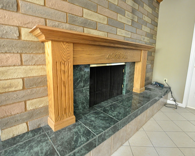
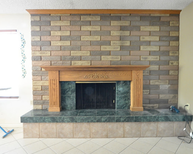
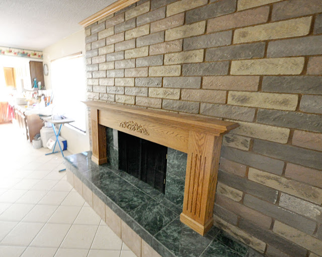
Specifically, this painted-bricked, heinously-tiled beast happening in my family room:
Is it just me or are there are way too many things going on here? Just for kicks, let’s list all the different materials/embellishments involved.
We’ve got your presumably standard brick wall surround, of course. A wood mantel. Forest green faux marble tile. The lighter tile on the floor (which runs throughout most of the house). A third tile–also neutral but different from the floor tile–between those two. And let’s not forget the crown molding, which is vaguely reminiscent of the too-short crown molding in the master swamp but which, surprisingly, is stained to match the mantel. Plus the fire screen and all that actual fireplace junk inside. Oh, and of course there’s the lovely stenciled ivy off to the side by the window which was briefly featured in my tour of trims.
Yeesh.
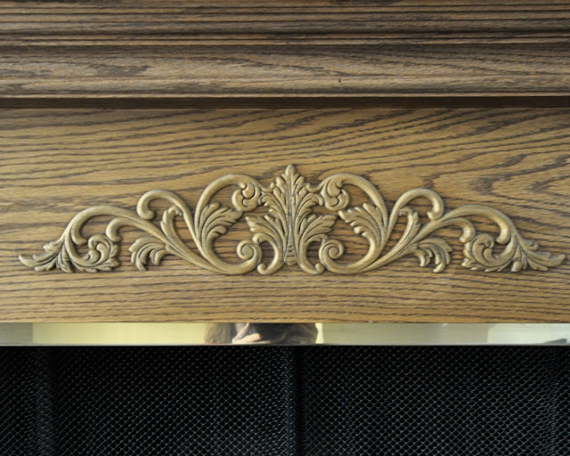
Even after living with it for five months, I am just baffled by the thing. I mean, it doesn’t surprise me that the previous owners would favor forest green tile (remember the forest green wall in the dining room?) or random stick-on wood detailing:
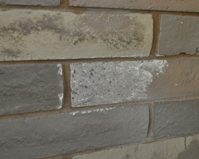
Or that they’d paint over the bricks to make them work with their unfortunate color schemes:
(David ground off some of the paint on one of the bricks to confirm that this is indeed what they did.)
It just…I don’t even know. There must certainly be uglier fireplaces out there, but this guy? This slightly asymmetrical eyesore? This is the ugly fireplace I live with, and for me that means he is the worst. And what do you even do with something like this? (Besides demolish it and start over, of course, because that idea is way more than I can handle right now.)
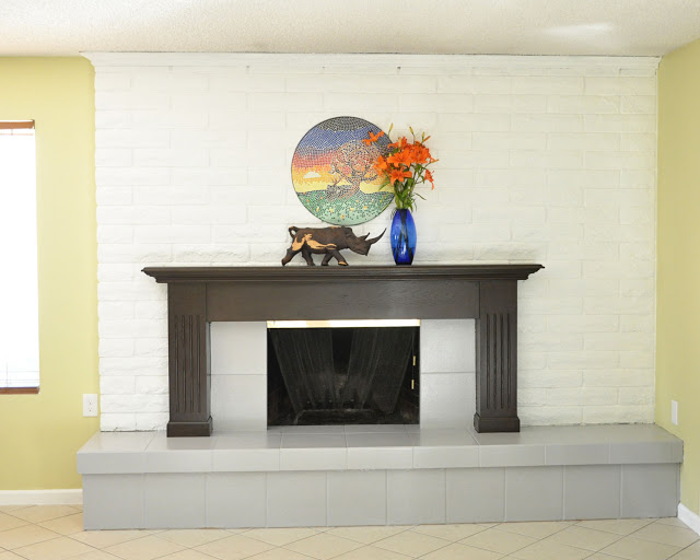
Right now we’re thinking paint. Lots and lots of white paint. If nothing else, it’ll brighten the room and bring some cohesion to the mess. I’d like to put in a new mantel; this one feels weirdly off-balance to me. Too wide or too short or a little of both. It’s hard to say. David likes it, though, so we’ll see.
What would you do with it?
You remind me of the brick in my brother's bedroom when we were growing up. It was painted in all sorts of random colors: red, green, etc. – it added some color to an otherwise very plain room. (of course, that would have been way too much in a public area!)
Red and green and other colors too? I can't even… Then again, my bedroom in high school was lime green, and the one before that was sponge painted purple, so I'm hardly in a position to judge.
A mantel like this could work and be less aesthetically abusive:
http://pinterest.com/pin/12314598951876690/
As for that tile… there are no words.
I definitely don't hate that. We'll see what David thinks. Thanks.
Repaint like mad! And pry off the weird flower thing on the mantel. And add something in the big space to make it look less off-centered (a potted plant, perhaps? A stack of firewood? It needs something).
This is bigger, but I'd move up the mantel and maybe get rid of the wood supports on the side, because they look like they were stolen from a pulpit. And get rid of all the tile and brick it instead. (bigger, I said!)
IT TOTALLY LOOKS LIKE A PULPIT. That is exactly what I've been thinking without even realizing it.
Good ideas, big and small!
Wow Jen! All I can say is wow!
Right? It's ridiculous.
Every time you show new pictures of your house, I wonder about the sanity of the previous owners. How do people live in these kinds of places? And where do they get these ideas that they think look good?
I would blame it on the 80's and say that nobody updated anything since the house was built, but I think the last family here bought it in the late 90's. Plus: bloody baby hands. Just no.
You could drywall over the brick and it would just look like the rest of the walls and then replace the mantle.
That's actually not a bad idea, and would work really well with what we are considering for our kitchen down the road. I'll run it by David tonight and see what he says. Good thinking!
By replace I mean paint it and put it back when you are done 🙂
wow.. I think the 90’s are calling, wanting their green tiles back!